

Welcome back to Peak of the Paint Booth for volume three! I can’t believe we’re already to the third volume, it’s always a blast being able to draft these up for our readers. This volume has some choices I think some readers will find peculiar, but I had to spice it up a little bit. As usual, let’s get right into it.
#5 Ty Dillon
Right out of the gate with a hot one! But I think my logic is sound here. The younger Dillon brother has been backed by Sea Best for the entire season and has largely run their black and red primary for every race. This was the case for Las Vegas, but I’ve wanted to fit it in the list for a few weeks now.
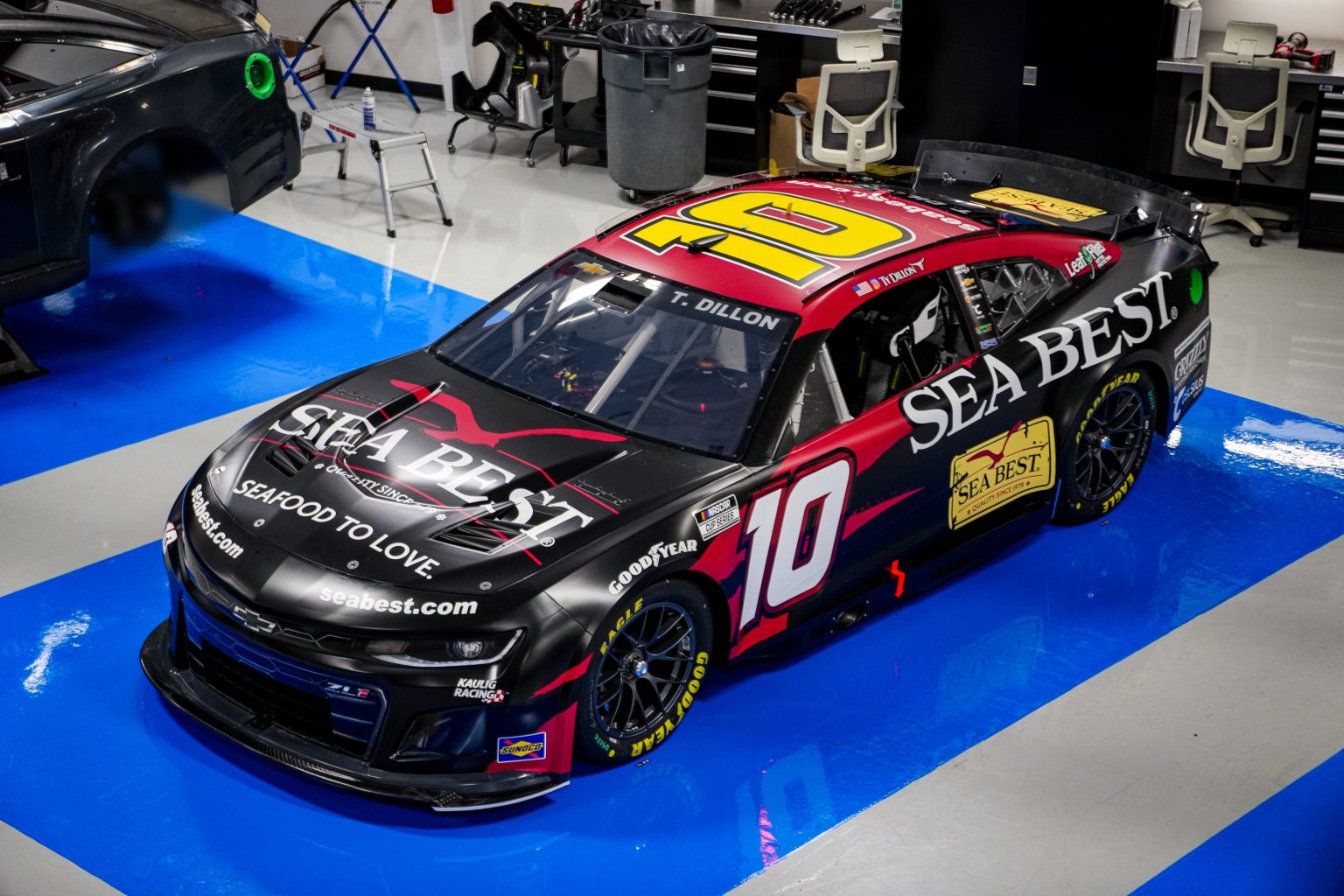
Black and red is always a winner for me. It’s striking and always catches eyes in motorsports. The sponsor itself does a good job of utilizing the extra space behind the number, and the design they use for the base makes a statement in itself. It’s what he brought to Homestead and allowed him to sneak onto the list.
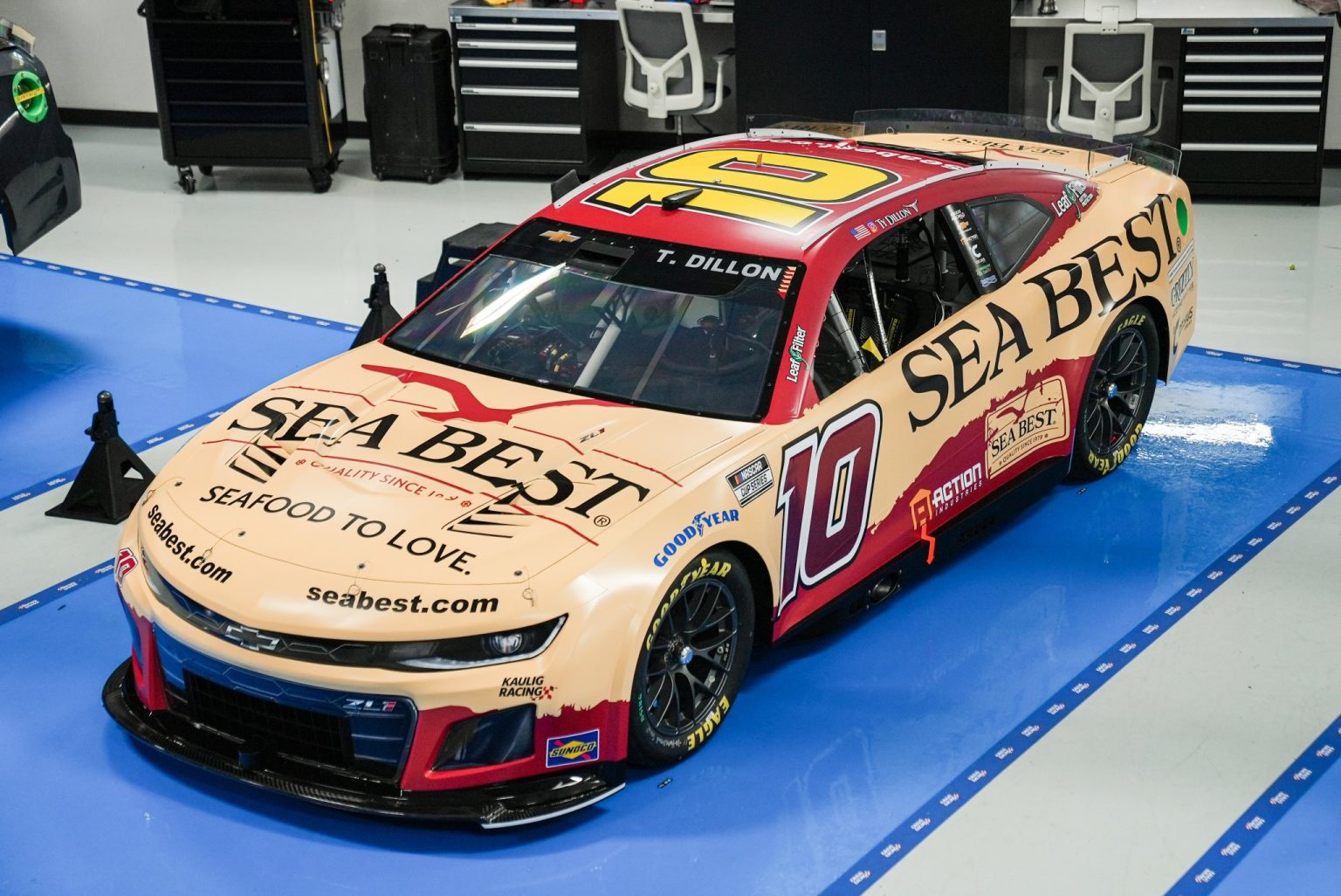
For whatever reason, the people at Sea Best were compelled to make a change to their primary and went with something more akin to the brand.
The change to their sandy brown as a base is phenomenal. The red works very well still, and Kauligs use of metallic numbers is great. The change in base color allowed Sea Best to really blow up the logo on the car and it’s far better than its predecessor. They should absolutely stick with this scheme going forward.
#4 Denny Hamlin
Dennis made some waves this past week securing a primary sponsor for 18 races this season, that being Progressive Insurance. Despite the fact their insurance absolutely blows, their race car designers do not, which we’ll touch on later in the ranking.
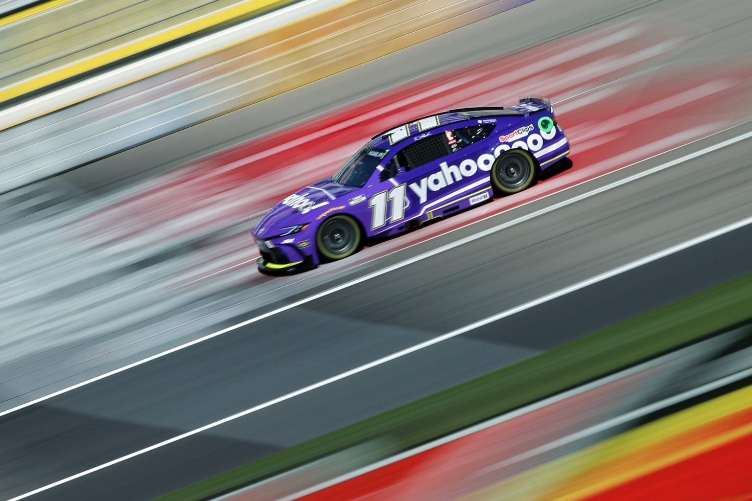
Denny sported Yahoo at Vegas, which already made our list two weeks ago so I won’t go too much into detail with that here, but it works very well once again. Let’s get back into Denny’s first big name sponsor since FedEx, Progressive.
Progressive came out swinging with their primary for the Cup series. Its trademark blue stands out in the field and the “Progressive” logo fits perfectly on the sides of the car. All of these things make for a great car, however the best part to me is the giant P logo on the hood that stretches down over the headlight sticker and grille. That’s something you don’t see often on designs and I love the commitment to the brand here. Still couldn’t get me to insure myself with them regardless.
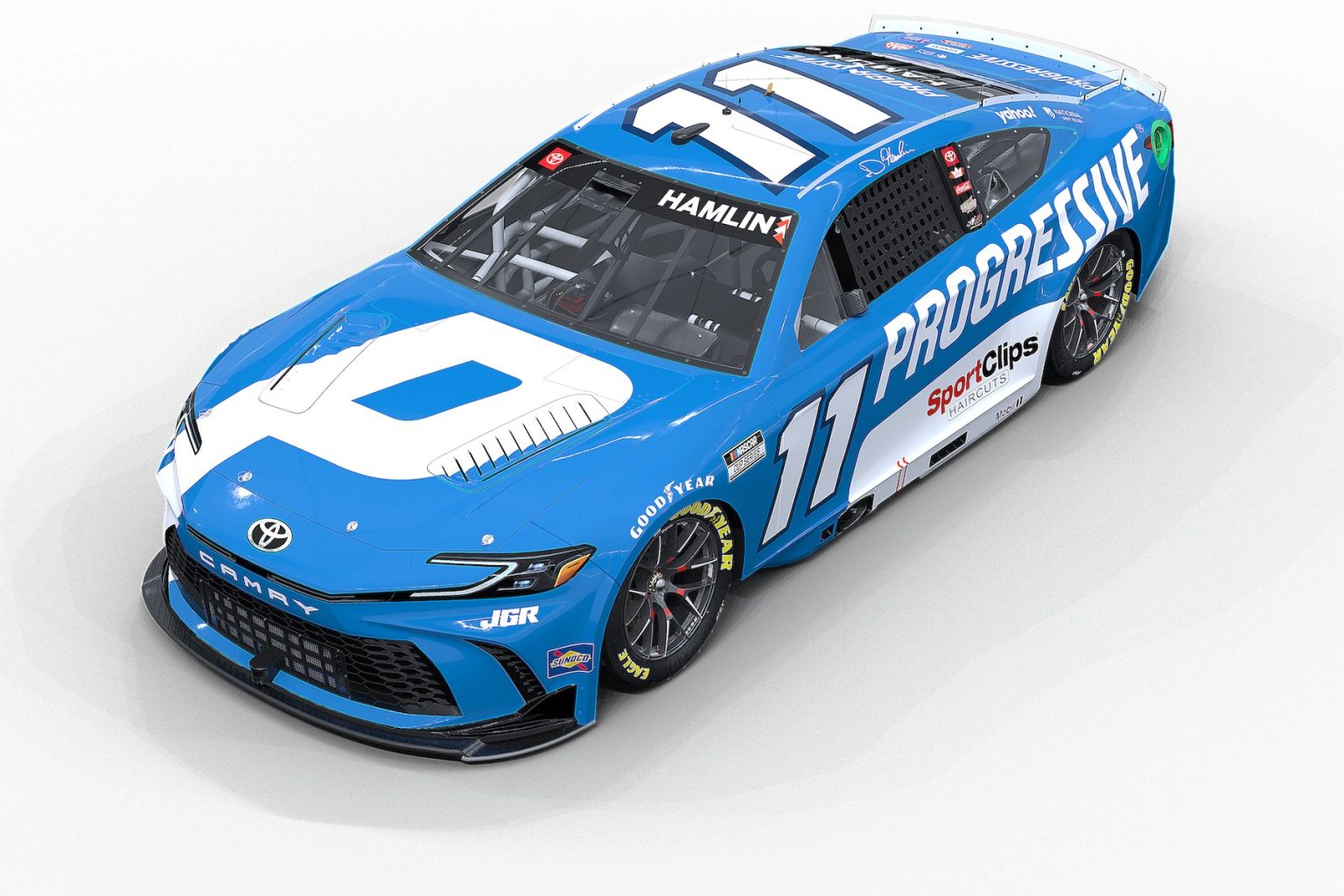
The one thing holding this scheme back from true greatness is the eyesore of the Sports Clips logo that requires a big white background behind it. Sponsors that insist their logo is on a certain backdrop and that it never changes color drive me up a wall. God forbid you show some character and humanity to people.
Denny has already shown us some awesome new schemes coming later in the year, like AMPM (Jack and I know this place well) and the Sport Clips throwback. I expect him to make his third appearance on POTPB sooner rather than later.
#3 John Hunter Nemecheck
This is my hottest take and I am quite alright with it. Legacy MC has been bringing heat to the track since the Clash, and was the first whole team to make the list rather than just a driver. This time it’s the 42 of JHN, who brought a Backstreet Boys car to Las Vegas, promoting a concert of theirs at the sphere.
The scheme itself is a fun one, with a strong gradient encompassing the car with different shades of blue. The backstreet boys themselves occupy the hood of the car with a giant png of the sphere behind them.
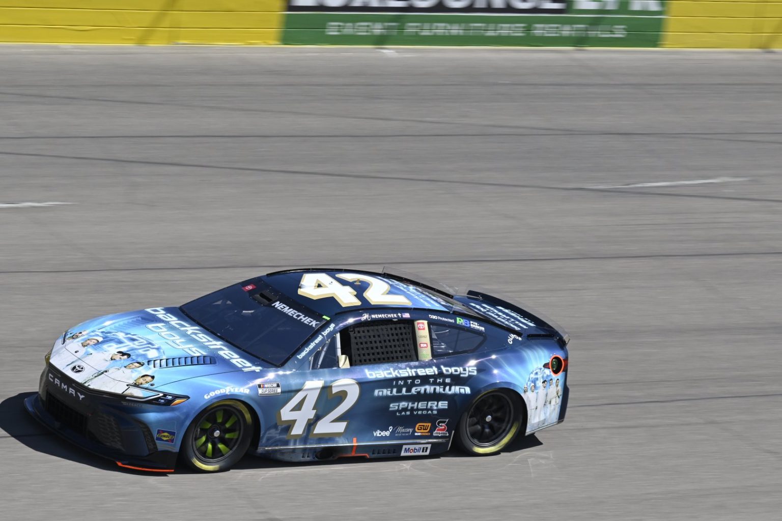
I don’t care how tacky it is, I love it. I love the marketing to the 10 people who still listen to the Backstreet Boys and I love the fact we have bands, even if they’re well past their heyday, on cars. This whole scheme is my guilty pleasure and I am hoping it makes an appearance in NASCAR 25 this upcoming fall.
JHN didn’t just have a cool musically inclined car to make this list. He brought the #42 Pye & Barker Camry to Homestead and this is a scheme I really enjoy.
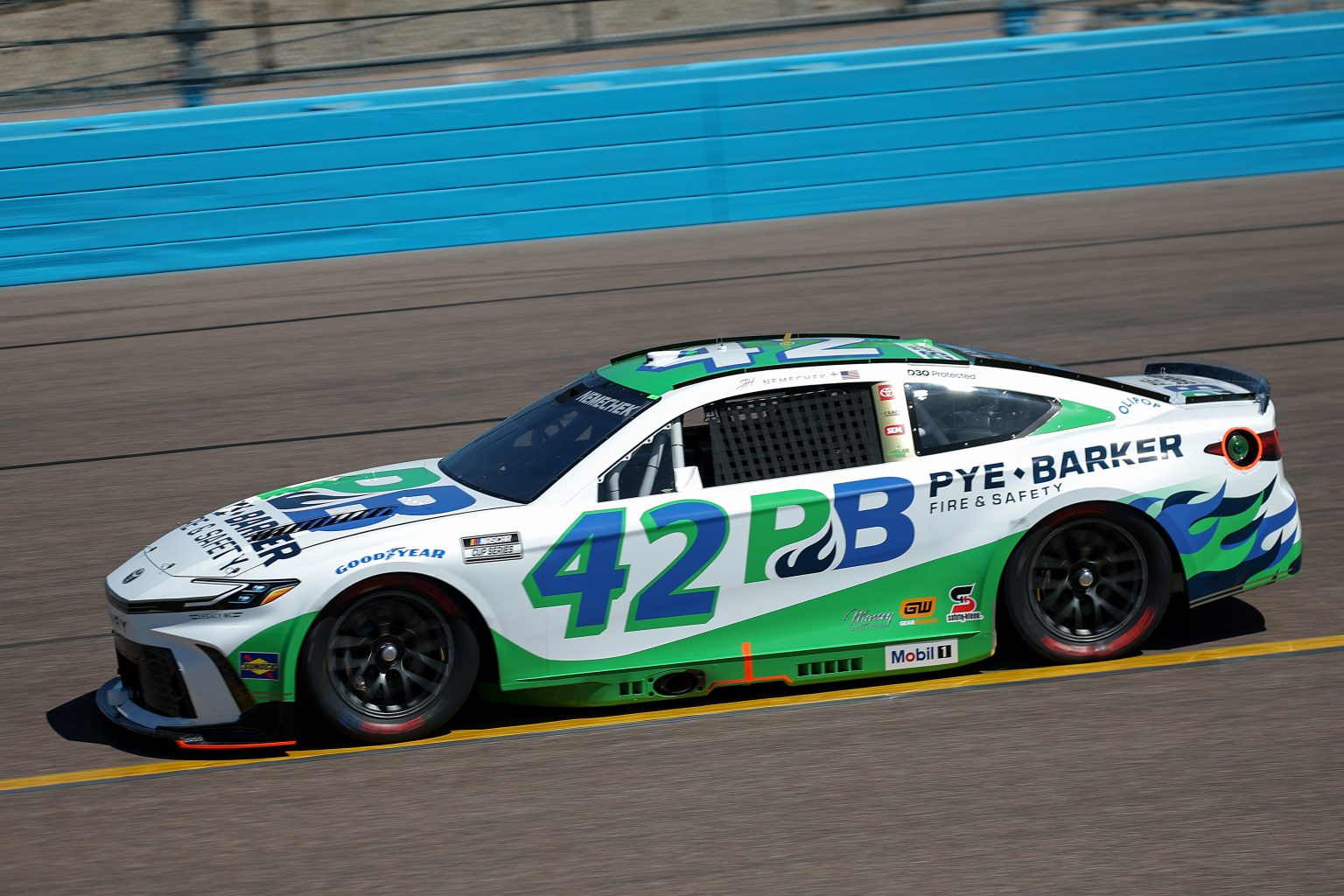
First of all, flames on a racecar are almost an instant winner for me. Absolutely fantastic. Jack and I hold some bias for these colors as well which I will absolutely admit, because I feel obligated to. I have no idea who or what this sponsor is, so that’s about the only reason it gets a ding from me
#2 Tyler Reddick
Reddick makes his first appearance on POTPB and it’s for good reason. He brought his Monster Beast primary to Vegas, and I love this car.
I’ve mentioned to Jack how it really just feels like a NASCAR Cup car. Alcohol as the sponsor, fantastic adjective for said alcohol, and a big Jordan logo on the rear quarter panel. It really would appeal to newer fans looking to get into motorsports in my opinion and I’ve loved it since he started using it (only bested by his orange beast alternative that he won 2024 Fall homestead with, I mean sheesh).
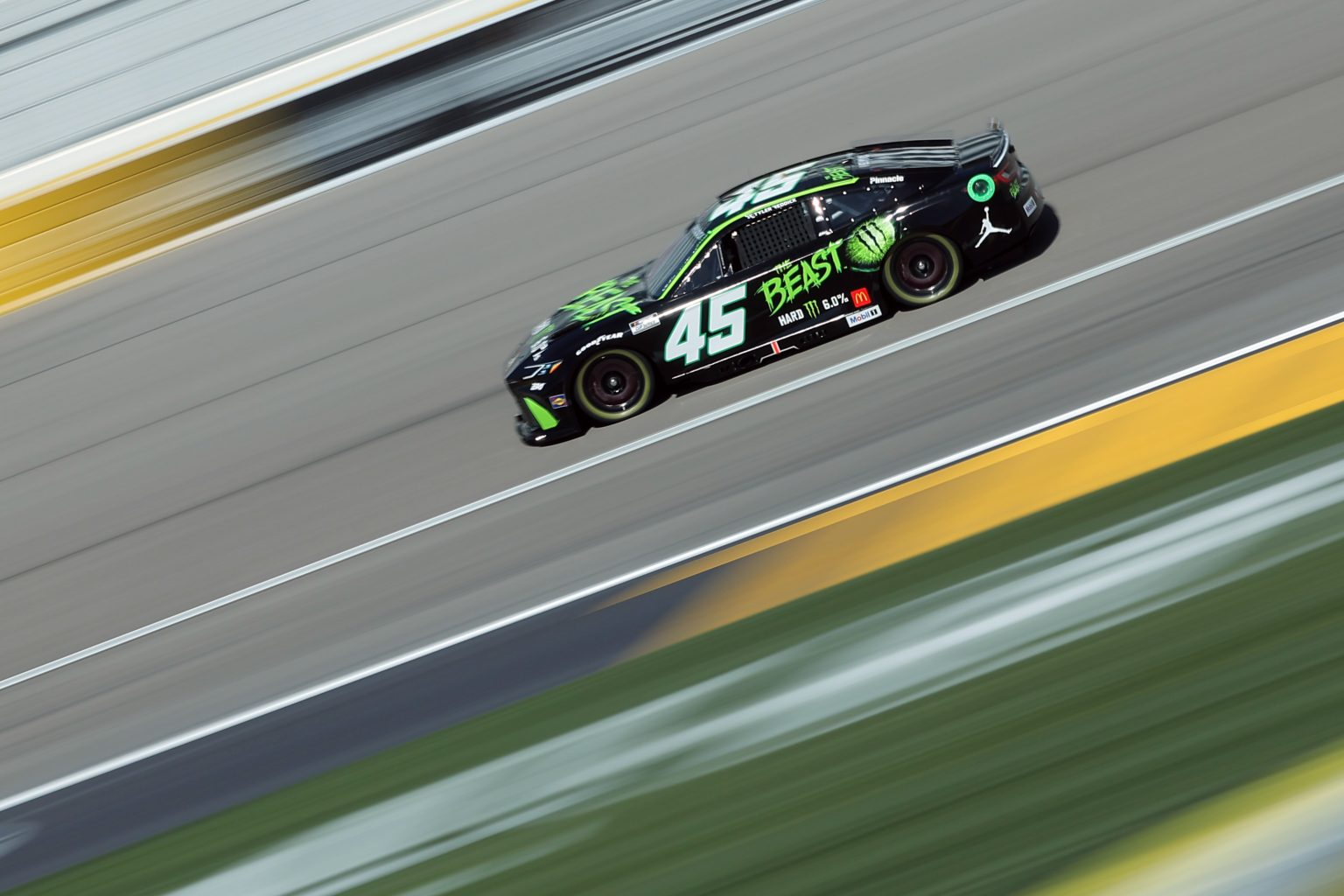
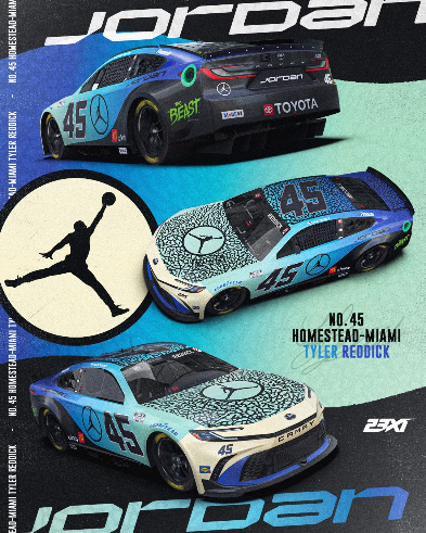
Reddick unveiled his first Jordan car since the “banned” Jordan 1 scheme from the clash, and I can’t ever deny a Jordan scheme. It still feels like a concept car seeing Jordan there, but it’s nonetheless awesome.
The gradient once again wins me over and I love the willingness to go from a blue to a tan. The elephant print used as a stripe is awesome as well, I just love these cars because it just feels like they come straight out of Nike’s HQ. I’m eager to see what else the brand brings to the track.
#1 Bubba Wallace
Look, you can go mull through the schemes we got at Vegas and Homestead yourself and tell me which teams and cars are out-scheming the 23 team. I really don’t feel as if I’m being biased so far this year. These cars are just that hot.
Bubba’s first Air Force alternate this year is based on the B-2 Stealth Bomber strategic jet and I absolutely love it. There are some things here that I could go without but the overall vibe of the car is striking and makes a statement.
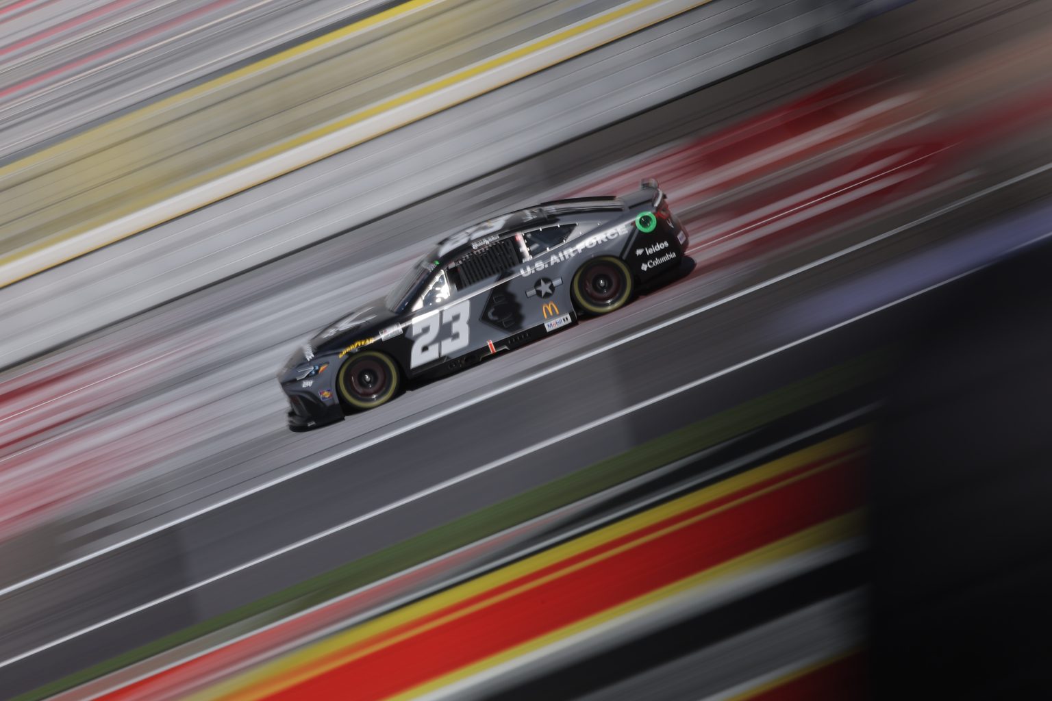
The usage of black and gray mends together well and the small chrome outline of the 23 makes this car feel professional. The one part of this scheme I could go without is the 2D picture of the bomber on the side of the car. I feel as if the empty space would be acceptable here due to the scheme’s stripe design.
Homestead saw another Columbia car come to the track and this time it’s a FISH CAR. Just great work, I absolutely love fish all around so anytime cars like these hit the track, I’m giddy (shoutout Chase Briscoe for the bass car, too).
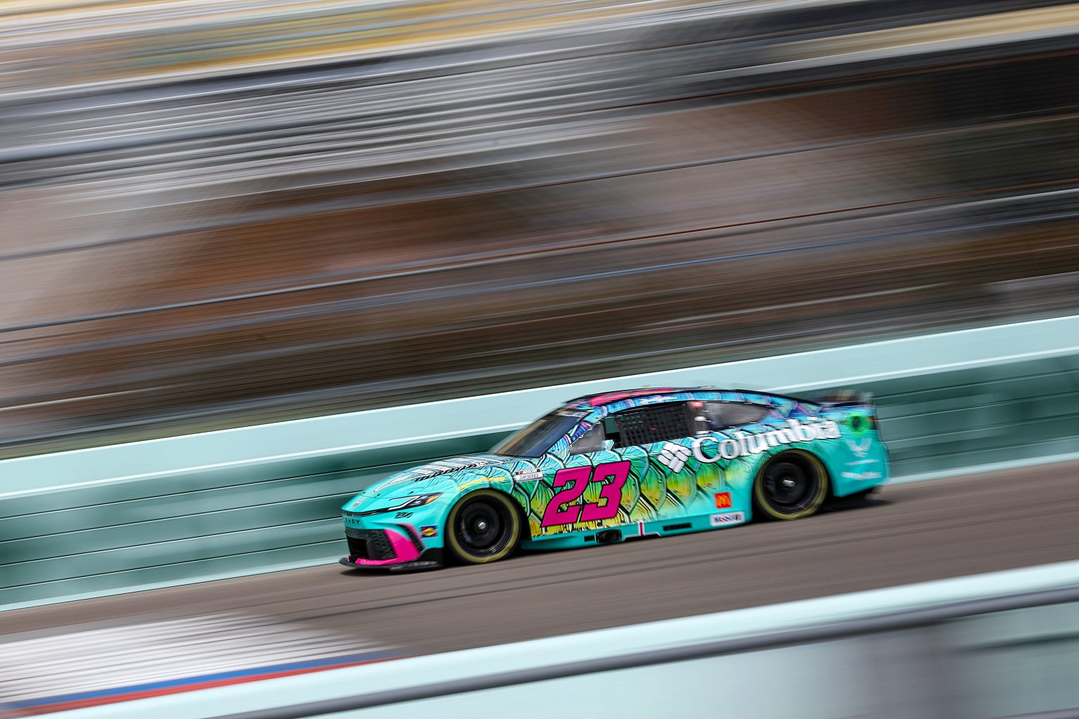
It’s based on the Tarpon, a large game fish native to the Atlantic. Blue and green scales that crawl up the car rock, and Columbia’s not shy to go crazy with the pink now which goes a long way for brand identity. The one thing I think the scheme could benefit from is pink logos, but the white is visible and still makes a statement.
Until I have a reason not too, Bubba will keep making this list. I envision it’ll happen as we repeat some schemes throughout the season, but so far they have come out absolutely swinging.
Honorable Mentions
Before we wrap up, Jack is going to enter the paint booth for some of his honorable mentions from the past week, that didn’t quite crack my list.
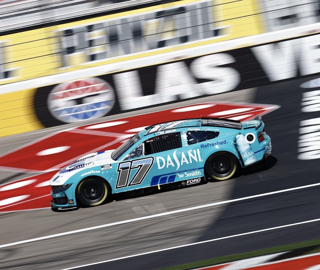
Shoutout to Cam for letting me hop in on this edition so I’ll start with the scheme that spurred this whole idea. Chris Buscher has been no stranger to great paint schemes, but his Dasani scheme at Las Vegas was a whole other level. Disregarding that horrible Kroger logo on the front, this car is perfect and the Dasani teal blue stands out amongst the field.
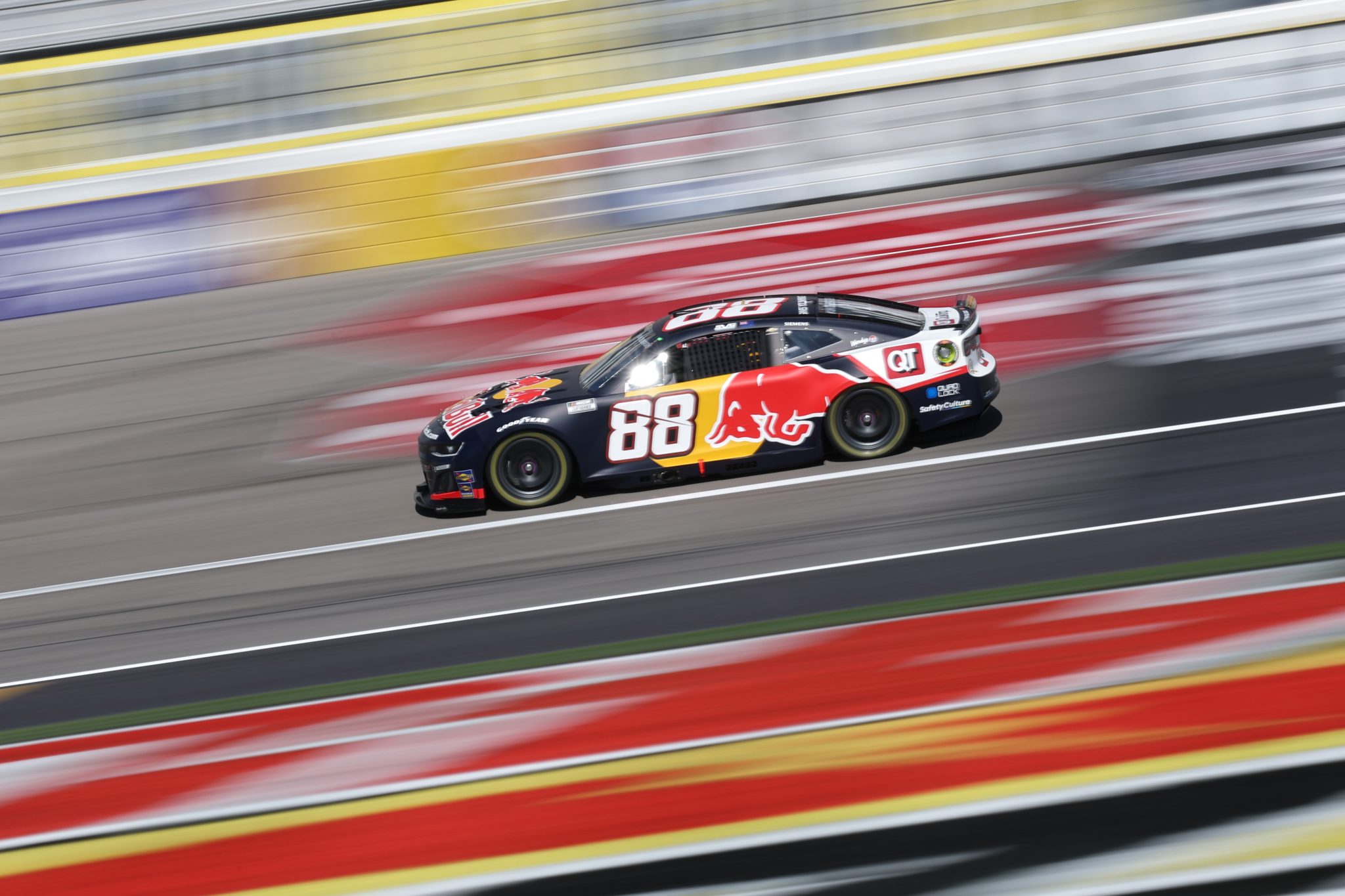
Lastly, let me throw Shane Van Gisbergen’s Red Bull scheme from Las Vegas on here as well. It still feels like a trip seeing Red Bull back in NASCAR and this scheme has everything you want, although it suffers from the forward number placement. It’s striking, it’s sick, it screams motorsports to me and for that it makes my list for this week.
That’s that for another edition of Peak of the Paint Booth. I feel as if I’m finally finding a groove here and it feels great. Head ups, Darlington will have its own edition for throwbacks. I can’t pass up the chance to talk about all the amazing stuff we’re getting in South Carolina.

Leave a comment