
Welcome back to the Peak of the paint booth, volume two! This edition has a lot of first timers who made a splash in these last two weeks with the heat they brought to the track. The two races we’ll be going over today are COTA and Phoenix. Let’s not waste any time here and cut to the chase with #5.
#5 Cole Custer
Cole Custer has made his return to the #41 Cup car this season after a few seasons of Xfinity which saw him win the series championship in 2023. With Tony Stewart’s departure from Gene Haas’ racing team, the team has changed to the Haas Factory Team, with the 41 being the lone car on the team.
It’s rebrand has been very successful in my opinion, with the last two entries the 41 have been some eye popping rides, even if the on track results have been less than favorable. The first entry was the Bonanza car, which sported some great colors in line with Haas’ team colors.
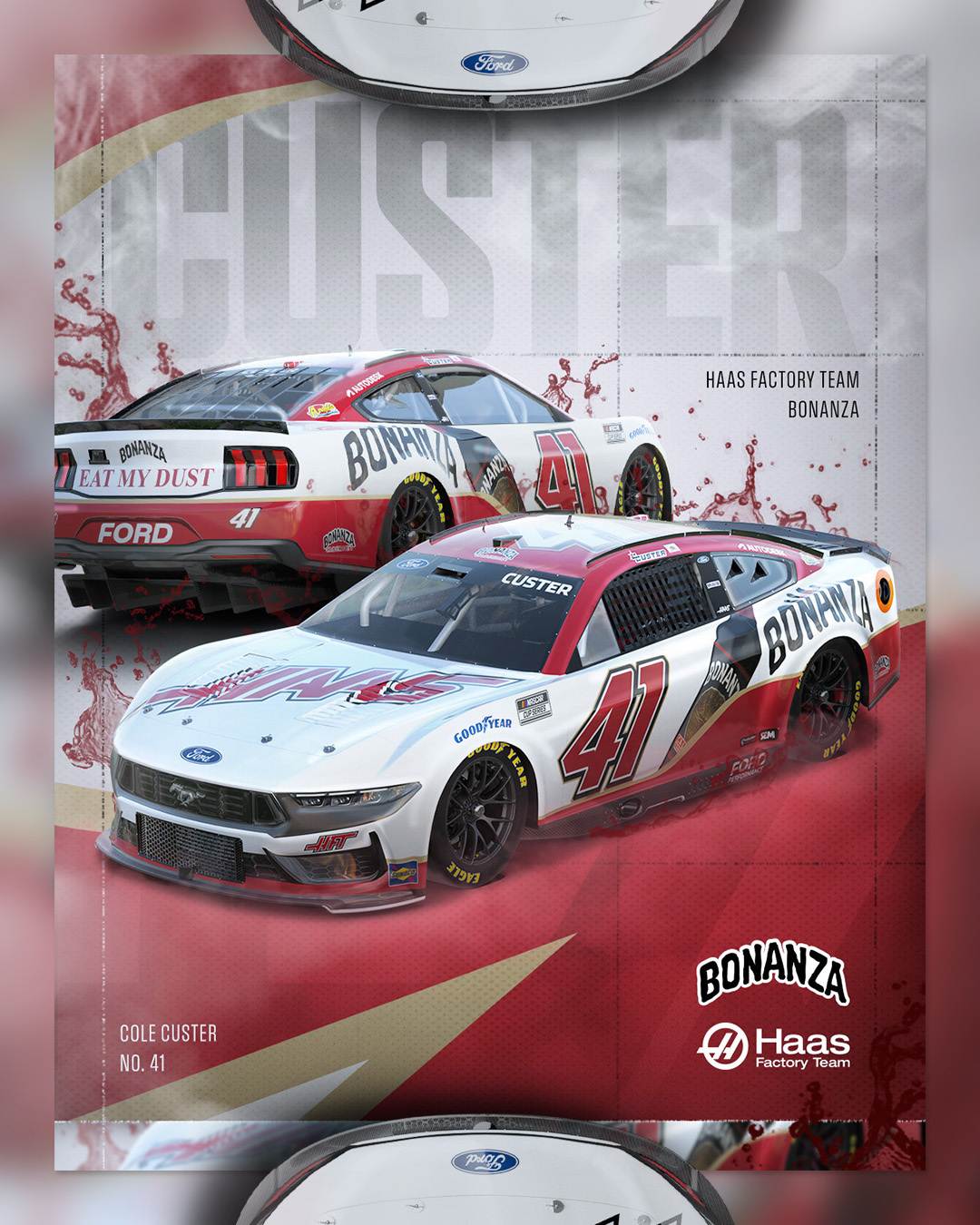
The sponsor’s willingness to take up a good amount of space works wonders here, with the product next to the brand logo filling things out really well. To top it off, an eye-catching Haas logo on the hood as well.
One longtime sponsor of Custer’s came back for his Phoenix entry, with Andy’s Frozen Custard taking the helm of the 41. This sponsor is a welcome sight in Cup again. I’ve always loved the bright colors and fun products.
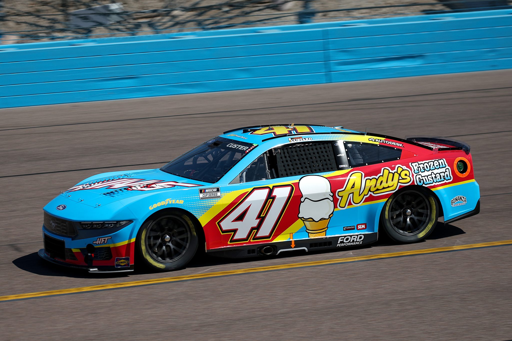
Not to mention, it gives me the excuse of saying Cold Custard. Haas has also been killing it in Xfinity as well, Sam Mayer’s green machine always captures my eye on the track.
#4 Alex Bowman
It’s nice to see the Showman this early in the series. The Ally team almost always puts on bangers for the 48, and the last two weeks are no different. Bowman started things with the primary Ally scheme, which certainly deserves its flowers for its fresh take for 2025.

The black base is meaaaan, and Ally did a great job incorporating their trademark purple here. Pink accents are a fun incorporation to things, and in the words of Clint Bowyer, “that’s one mean looking hot rod.”
Bowman came to Phoenix with his annual “best friends” scheme by Ally, and this will probably be my most biased choice on the list. The base design for the car reminds me of something you’d find in an old NASCAR game paint booth.
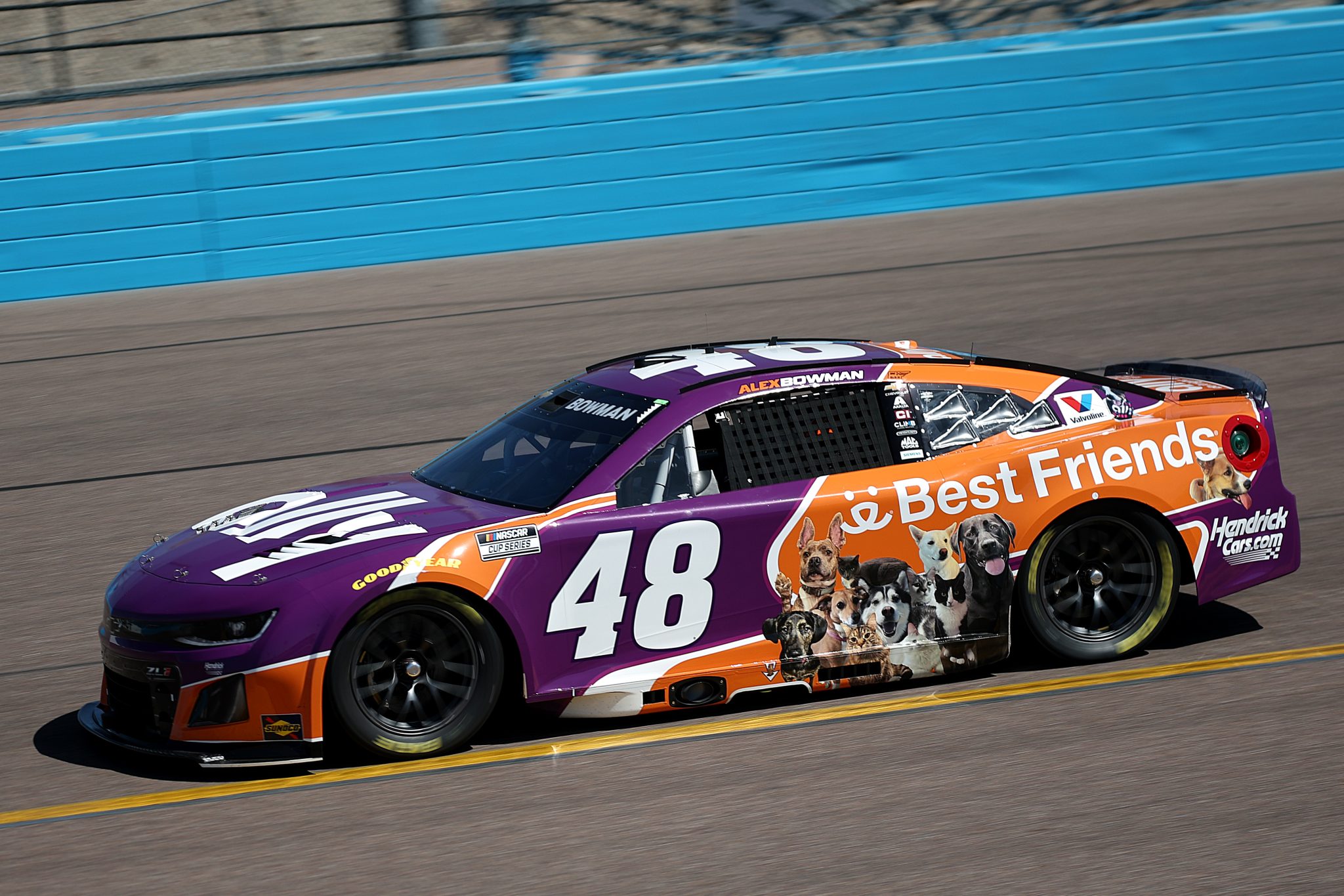
Purple and orange in Phoenix never goes wrong, and to cap it all off we have a bunch of cute dogs and cats slapped right on the side. Is it the best done version of this scheme? No, but it has cute animals so it’s a big winner for me.
#3 Bubba Wallace
23XI continues to bring the heat for the 23 team and really for every driver on the roster. The shared Mobil 1 scheme across the team was run for the first time on Bubbas 23 at COTA, and it seems that the sponsor has really found their groove with the Toyota team.

The first and foremost part of this scheme that works is the return of the pegasus. It never fails and is a wonderful part of the branding. I love the spread of color in the scheme itself and it’s nice that it’ll be shared among the 23XI drivers.
Bubba’s scheme at Phoenix is a rather simple one we’ve seen already, as he brought back the all white Leidos scheme from the Clash. I like the choice to go to white from Leidos this season as it puts a better brand emphasis on their primary color of purple.
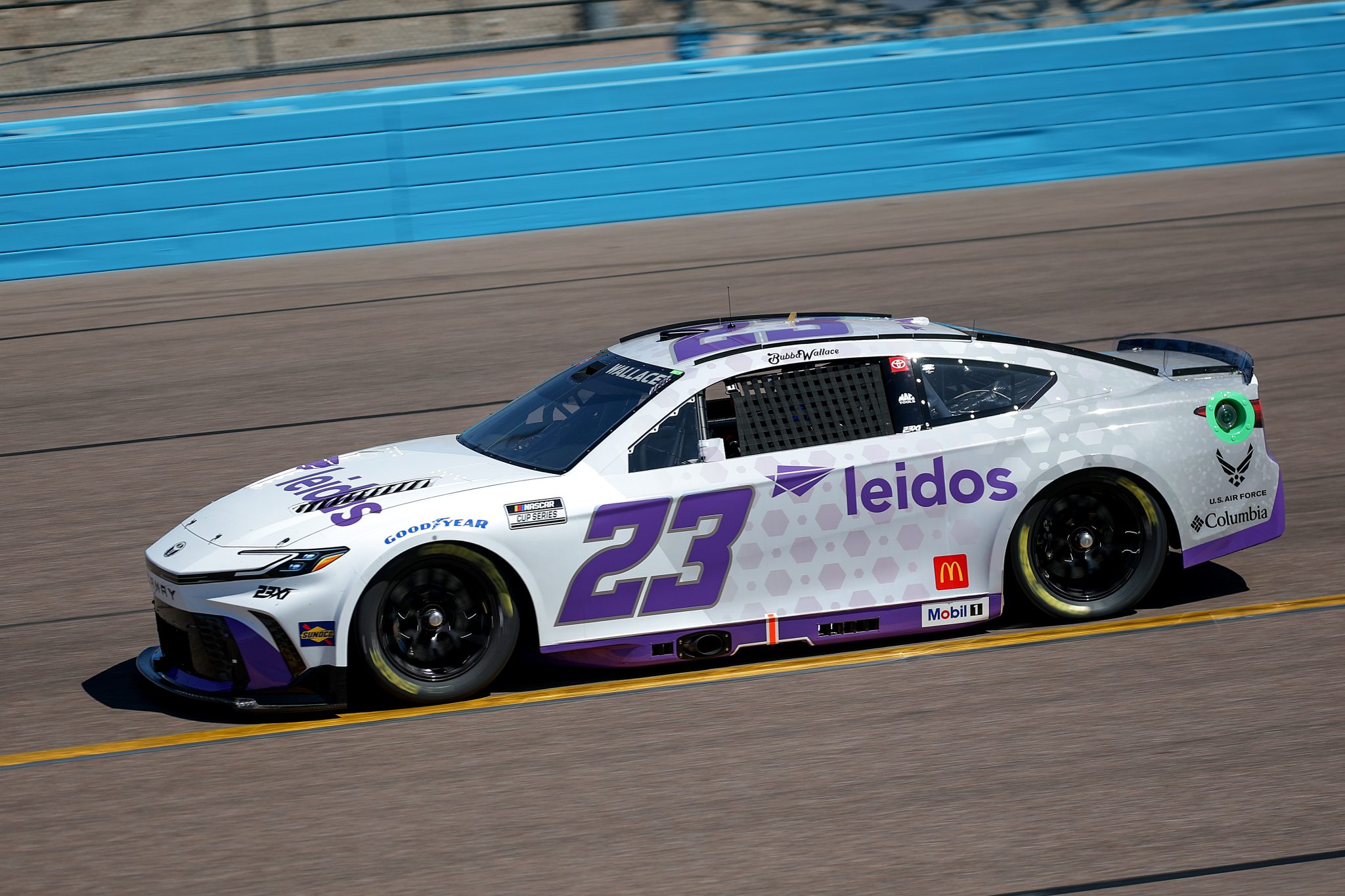
It’s nice to see them support my driver for another season, I had no idea what they did until I saw the logo on a security x-ray at the airport, funnily enough.
I’m excited to see what the 23 team will bring to the table this year. Their recent reveal of the new Air Force car wasn’t my favorite, but I have no doubt sponsors like Columbia will continue to bring the heat for Bubba and co.
#2 Ross Chastain
In a team full of sponsors like Red Bull, WeatherTech and others, Ross Chastain still brings plenty of heat every season to throw with his teammates. It helps having a sponsor like Busch Light to give you some notable entries, and everything was bigger in Texas at COTA.

Ross sported a Texas flag themed Busch Light car, with lonestars and a massive set of bull horns on the hood of his Chevy ZL1. It’s a scheme perfect for the state, track and driver, and he used the bull horns immediately to send Chase Elliott into the dirt which frankly adds to its aura. I’m excited to see what else Busch Light cooks up this year, they always seem to have innovative schemes that try different things (I’m looking at you Crocs car)
Ross’ next scheme has far less of a “wow” factor however it’s orange, and we like orange around here. Kubota comes back to the #1 in 2025 promoting their “Orange Days” sales event, and went with a primarily black scheme to bring attention to the event itself.

It’s an interesting choice given the name, but the contrast is done well here overall. I do wish the event had a better logo that wasn’t a giant block, but I understand the direction they chose to go in. Ross’ COTA scheme pulled a lot of the weight here
#1 Brad Keselowski
RFK makes the list for the first time this season and its first place! The last two schemes Brad has run really work, and there are small stylistic choices that the team makes on every scheme that I love.
Brad started things off with the Castrol scheme at COTA and it’s absolutely perfect, in my opinion. Castrol made the correct choice changing their branding to a more fluid and timeless font design, their previous look was giving off 2005 vibes pretty heavily.
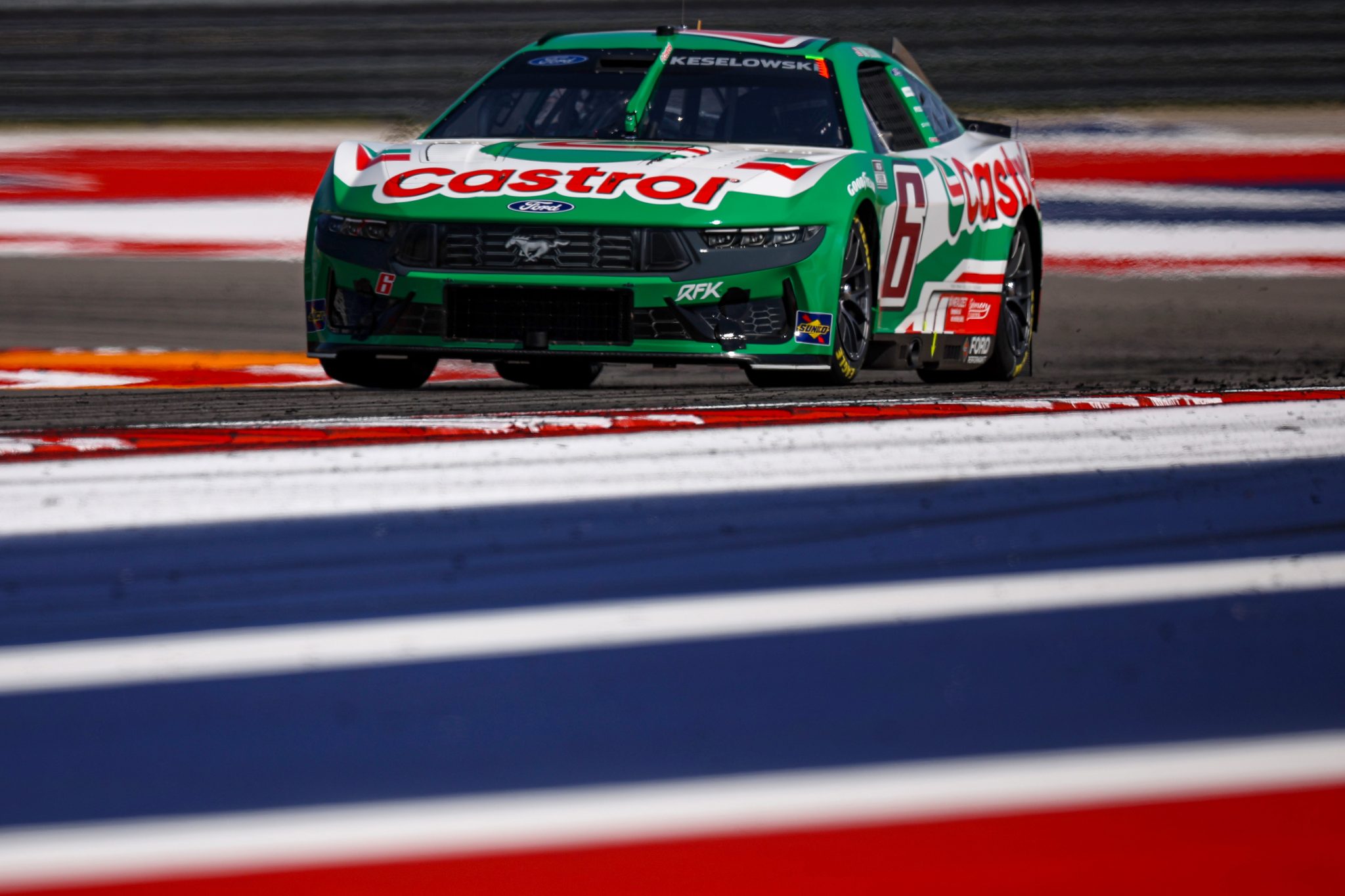
The willingness to embrace the old school colors are amazing, and this is where RFKs design choices really work. You have the foil number in a nice deep red, along with the RFK stripes that go along the side skirt of the car. Great stuff. Castrol will always have my love after their Tom’s Supra livery from last year, considering I’m an avid Gran Turismo enjoyer.
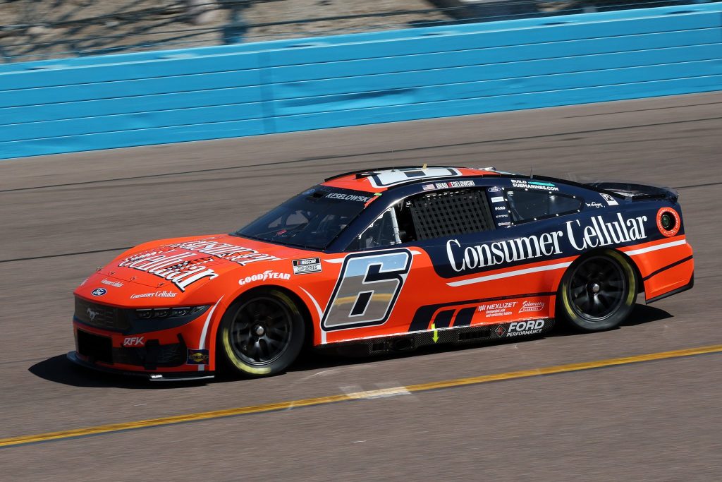
Brad’s next car at Phoenix saw the return of Consumer Cellular, and while the scheme absolutely works with its striking orange and blue combo, the cherry on top of this car and partnership were the advertisements beforehand.

I can’t get enough of muscle firesuit Brad wheeling around the #6 Convertible Mustang. It’s goofy and fits RFK’s brand perfectly. Sponsors leaning into their partnerships with teams is what creates the most success, in my opinion.
Consumer Cellular’s logo itself isn’t exactly inspiring, but the way it’s been used to take up a significant amount of space on the hood and fenders is great. Plus, gotta love a chrome number on the side.
This edition wasn’t the craziest lineup of paint schemes I’ve ever seen, but there were plenty of new drivers who made the list and I don’t expect that to change anytime soon. Tune in the week after next for volume three!

Leave a comment